How to Understanding Color Schemes in Design and Illustration

A color scheme is a combination of colors used in design to create visual harmony and convey certain emotions. Choosing the right color scheme can enhance the aesthetics of a work, whether in graphic design, illustration, or interiors. This article will discuss the different types of color schemes and how to use them effectively.
- Definition of Color Scheme
A color scheme is the selection and arrangement of colors based on color theory. Color theory helps designers choose color combinations that work harmoniously to create an appealing visual effect and convey a certain message.
- Types of Color Schemes
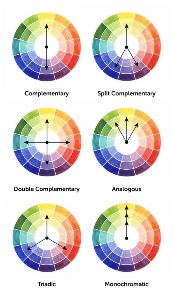
a. Monochromatic Color Scheme
This scheme uses one base color with variations in brightness and saturation. Examples are various gradations from light blue to dark blue. This scheme gives an elegant and harmonious look, but can feel monotonous if not combined with other visual elements.
b. Analogous Color Schemes
Uses colors that are next to each other on the color wheel, such as blue, green, and yellow. This scheme creates a soft and comfortable feel because the colors chosen have a close relationship.
c. Complementary Color Scheme
Using opposite colors on the color wheel, such as blue and orange or red and green. This scheme creates a strong contrast and is often used to attract attention.
d. Split-Complementary Color Scheme
Similar to the complementary scheme, but uses two colors that are adjacent to the main complementary color. For example, if the main color is blue, then the complementary colors are orange-yellow and orange-red. This provides a balance between harmony and contrast.
e. Triadic Color Scheme
Uses three colors that are equally spaced on the color wheel, such as red, yellow, and blue. This scheme is often used in designs that are cheerful and full of energy.
f. Tetradic (Double Complementary) Color Scheme
Uses two pairs of complementary colors, such as blue-orange and red-green. This scheme provides flexibility in design, but requires good balance so as not to look too busy.

- How to Choose the Right Color Scheme
Determine the purpose of the design: Do you want to create a calm, energized, or luxurious atmosphere?
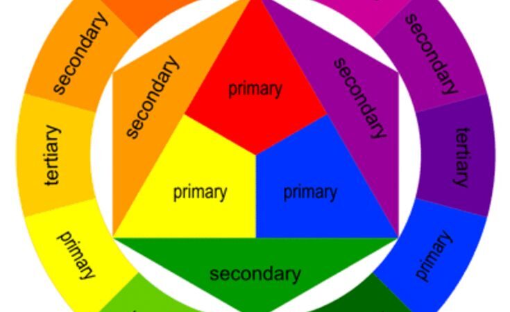
Use color theory: A color wheel can help you find harmonious combinations.
Pay attention to color psychology: Colors have an emotional impact, for example, blue gives a sense of calm, while red creates energy and excitement.
Test color combinations: Use tools like Adobe Color or Coolors to see how colors work together.

- Conclusion
Color schemes are an important element in design that can affect the aesthetics and emotions conveyed. By understanding the different types of color schemes and how to use them effectively, designers can create works that are appealing and fit their visual communication goals.

