

How to understand Color Theory
Color theory is a concept that explains how colors interact with each other and how they can affect visual perception. It is often used in fine art, graphic design, fashion, and various other creative fields to create harmonious color combinations or express certain emotions.
Understand the basic concepts of color theory that are essential in art and design, including illustration. Understanding how colors work and how to use them can improve the quality of your work. Here is a simple explanation of color theory that can help you in creating interesting illustrations.
1. Color basics
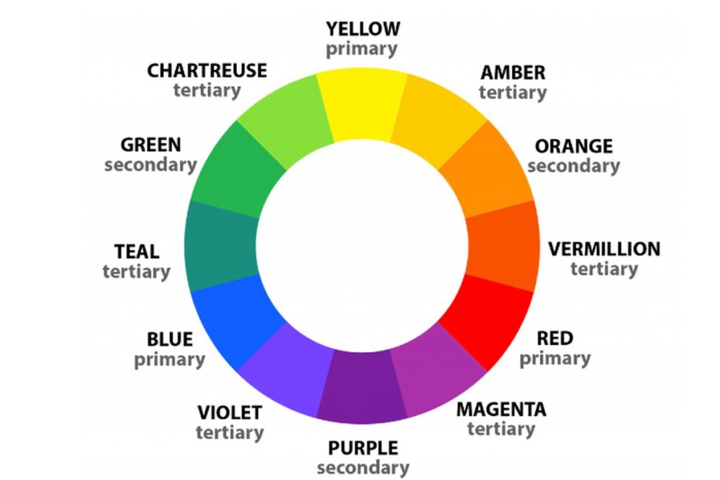
Primary Colors: These are basic colors that cannot be made by mixing other colors. There are three primary colors: red, blue, and yellow.
Secondary Colors: These are colors produced by mixing two primary colors. For example :
– Red + Blue = Purple
– Red + Yellow = Orange
– Yellow + Blue = Green
Tertiary Colors: These are colors produced by mixing primary and secondary colors. For example, yellow-green or red-purple.
2. Color Wheel
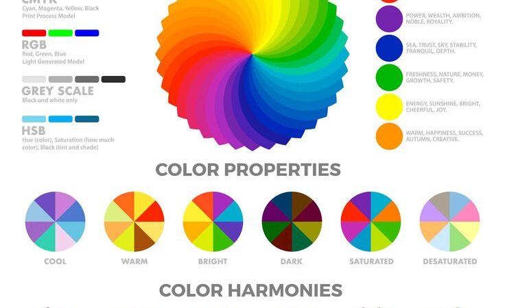
A color circle (or color wheel) is a visual representation of the arrangement of colors organized in the form of a circle, which is used to show the relationship between primary, secondary, and tertiary colors. The concept of the color circle is very important in color theory as it helps us understand how colors interact and how to create harmonious color combinations.
3. Color Scheme
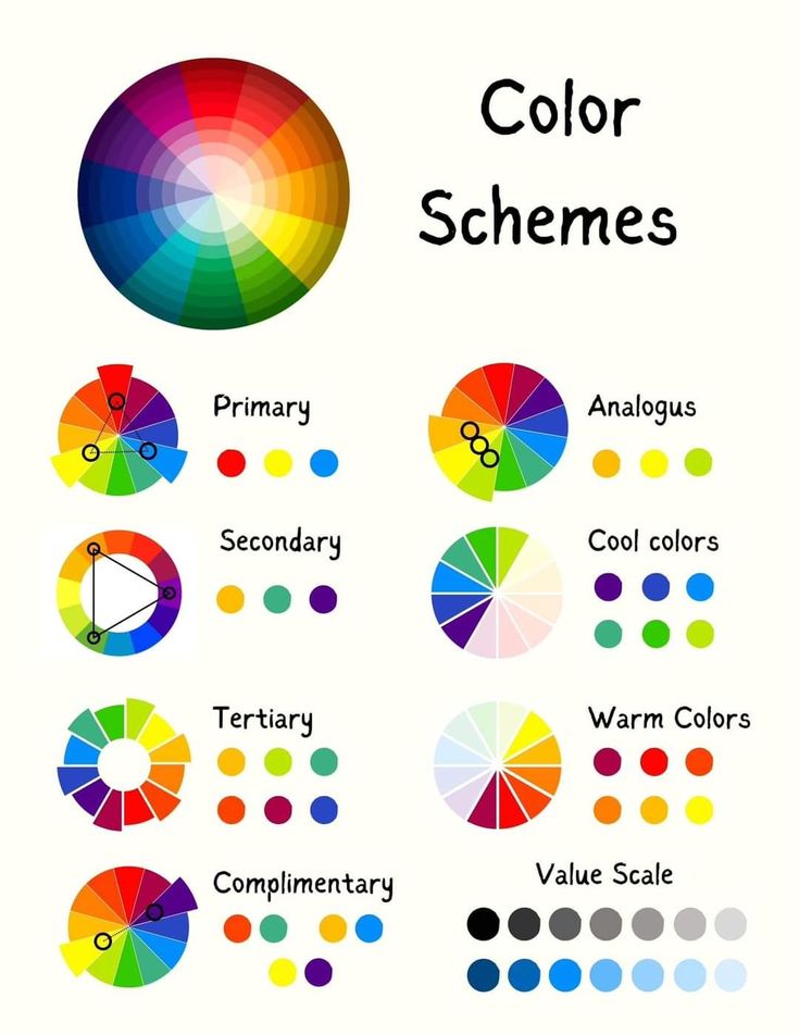
A color scheme is a combination or arrangement of colors used to create a design that is harmonious, attractive, and has a certain visual effect. Color schemes are used in various disciplines such as graphic design, art, fashion, interiors, and others, to achieve visual balance and create a desired atmosphere. There are several types of commonly used color schemes, each with different basic principles and psychological effects.
Here are some popular types of color schemes: Monochromatic Color Scheme, Analog Color Scheme, Complementary Color Scheme, Split-Complementary Color Scheme, Triadic Color Scheme, Tetradic Color Scheme (Two Pairs of Complementaries), Monochromatic Color Scheme, Neutral Color Scheme
4. Color Psychology
Color psychology is the study of how colors affect human feelings, emotions, and behavior. Each color has certain associations that can affect how people respond to or interact with their surroundings. In design, marketing, art, and even in everyday life, color selection can have a huge impact on moods, decisions, and perceptions.
Colors are often chosen to create a specific effect or to communicate a message without words. For example, red can evoke energy and passion, while blue can provide a sense of calmness and confidence. An understanding of color psychology is essential in fields such as graphic design, marketing, advertising, and even home interiors.
Here are some common colors and the psychological associations usually associated with them :
- Red: Energy, love, or anger.
- Blue: Peace, trust, or sadness.
- Yellow : Happiness, creativity, or warning.
- Green: Nature, growth, or tranquility.
- Black: Elegant, mysterious, or luxurious.
- White*: Cleanliness, simplicity, or innocence.
Understanding the meaning of colors can help you convey the desired message in an illustration
Color theory is a very useful tool in illustration. By understanding the basics of color, color schemes, and their psychological effects, you can improve the quality of your artwork. Take some time to experiment and practice, and you’ll soon see how color can bring your illustrations to life!